GWAS Spillover Pipeline - Visual Analysis
Visual Diagnostics
Generated: December 5, 2025
These figures follow Tufte’s principles for the visual display of quantitative information: maximizing data-ink ratio, clear labeling, and letting the data speak.
1. Treatment Cascade Over Time
How knowledge spillovers spread through the gene-disease network over time. Direct GWAS discoveries seed the network, then cascade outward through 1-hop, 2-hop, and 3-hop connections.
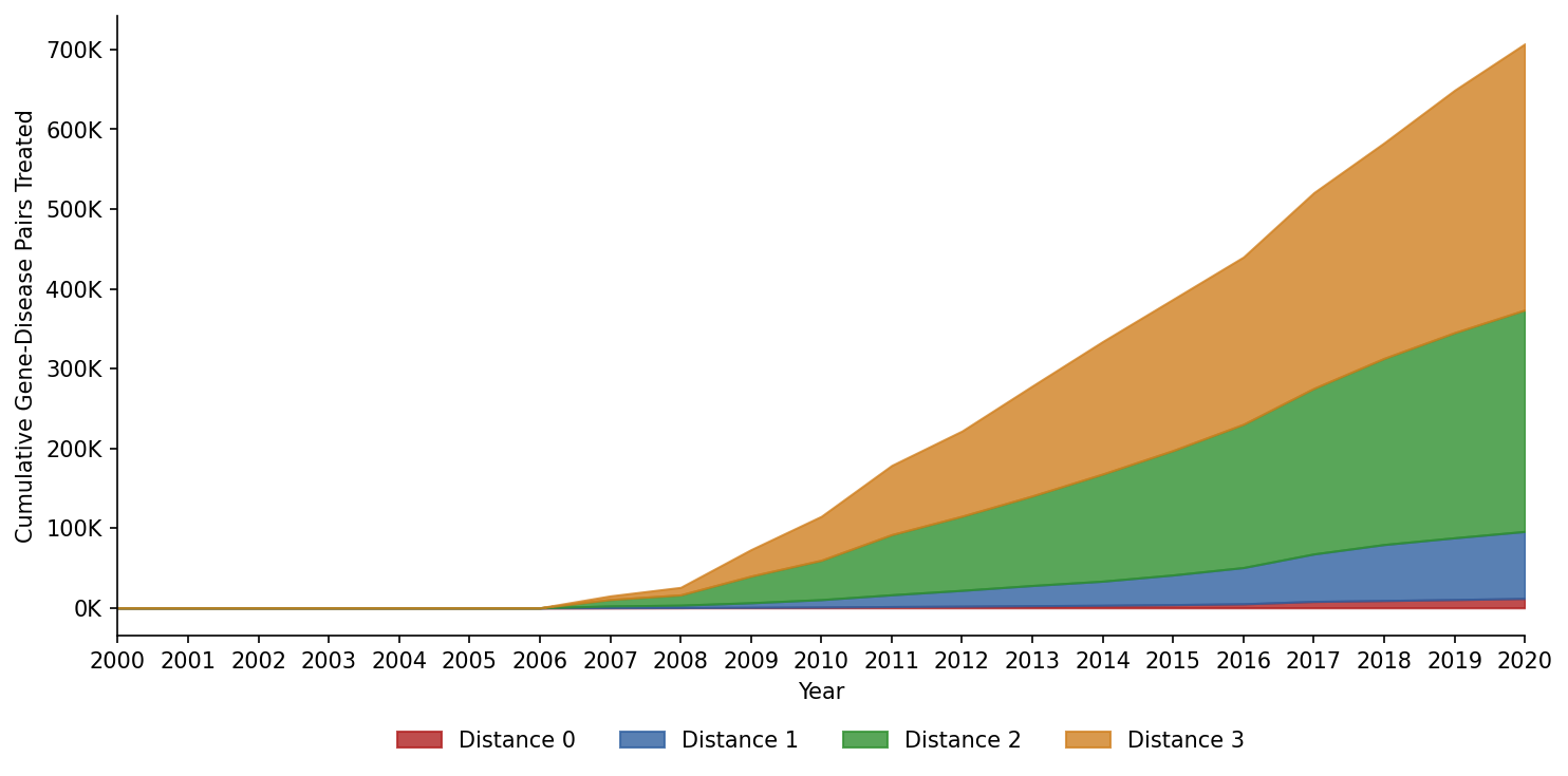
Key insight: Treatment coverage accelerates after 2010, with most spillover pairs treated through 2-hop and 3-hop connections.
2. Event Study: Patents Around Treatment
Small multiples showing patent activity in the years before and after treatment, separately for each spillover level.
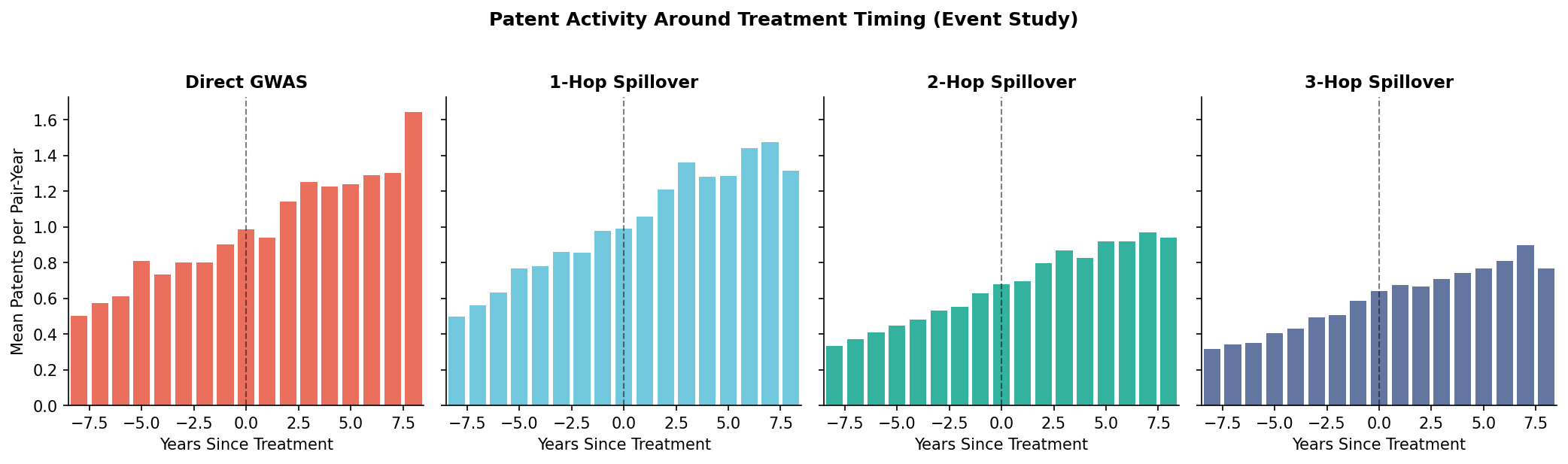
Key insight: Look for pre-trends (should be flat before t=0) and treatment effects (changes after t=0).
3. Probability Threshold Analysis
The 99% BioBERT probability threshold is a key data quality decision. These panels show the trade-off between precision and coverage.
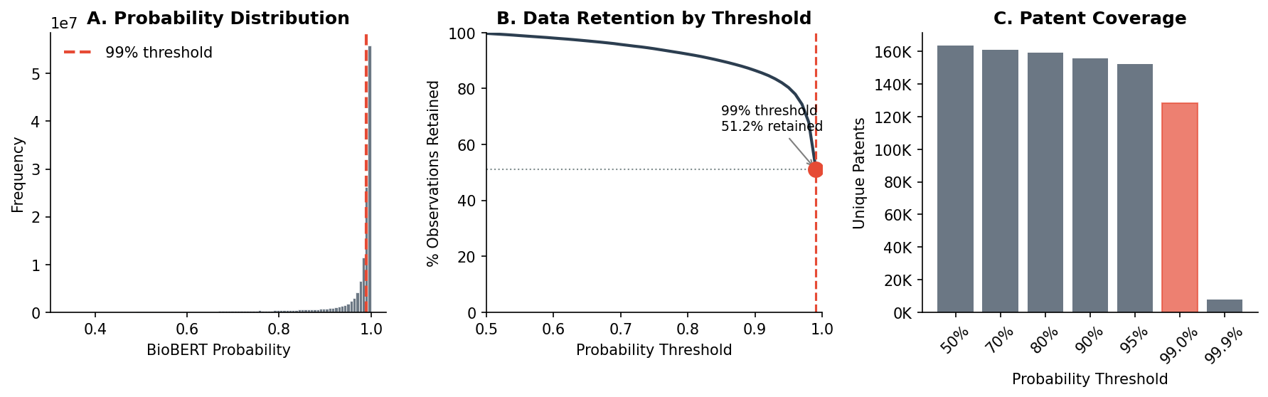
Panel A: Distribution of probabilities (most are high confidence) Panel B: Data retention curve showing steep drop-off above 95% Panel C: Unique patent coverage at different thresholds
4. Treatment Coverage Breakdown
The composition of the 148 million observation panel by treatment status.
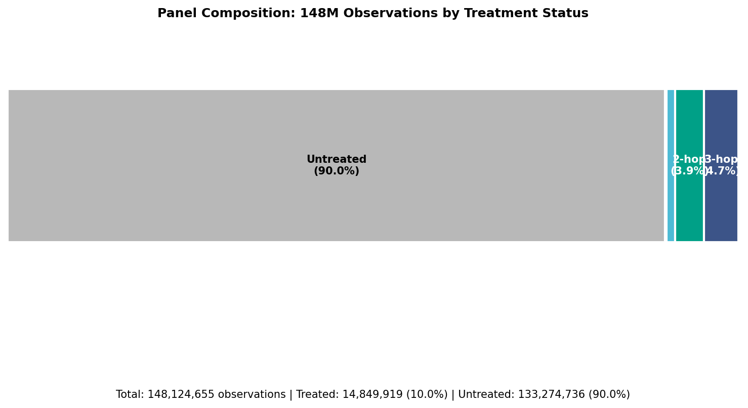
Key insight: 90% of observations are untreated (control group), 10% are treated across different spillover levels.
5. Patent Trends Over Time
Aggregate patent activity in the panel across years.
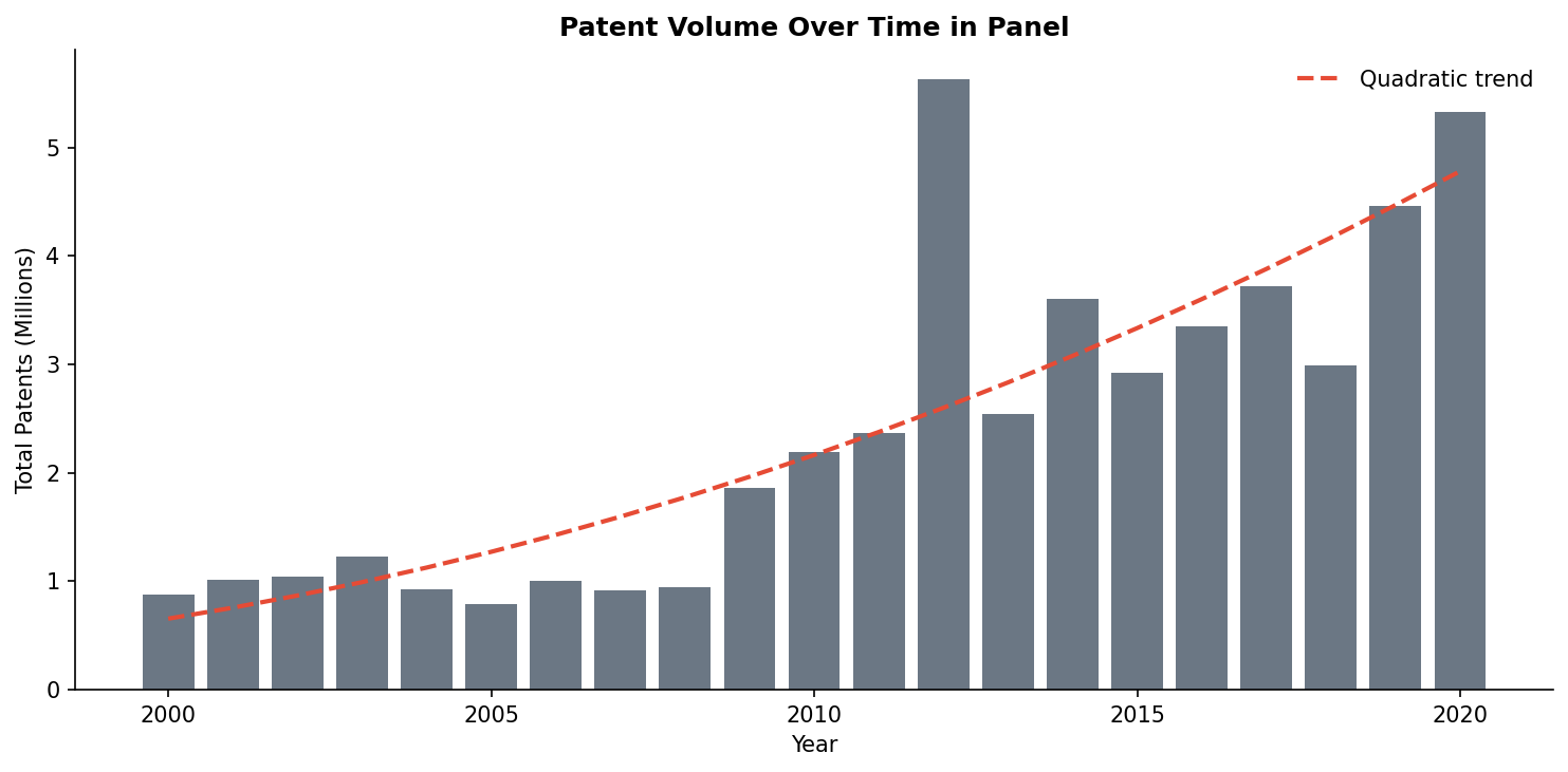
Key insight: Patent volume shows a quadratic growth pattern, accelerating in recent years.
6. Spillover Network Schematic
Conceptual visualization of the spillover structure. Knowledge flows outward from direct GWAS discoveries through the gene-disease network.
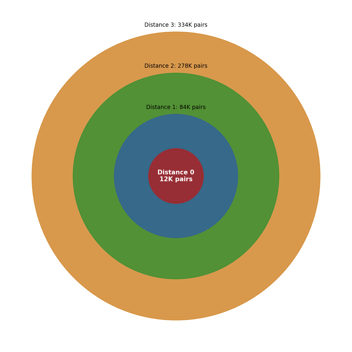
Structure:
- Direct GWAS: 35K pairs (core)
- 1-hop: 189K pairs (immediate neighbors)
- 2-hop: 814K pairs (second-degree connections)
- 3-hop: 1.02M pairs (third-degree connections)
7. Concentration Analysis (Lorenz Curves)
Are patents concentrated among a few genes/diseases, or spread evenly?
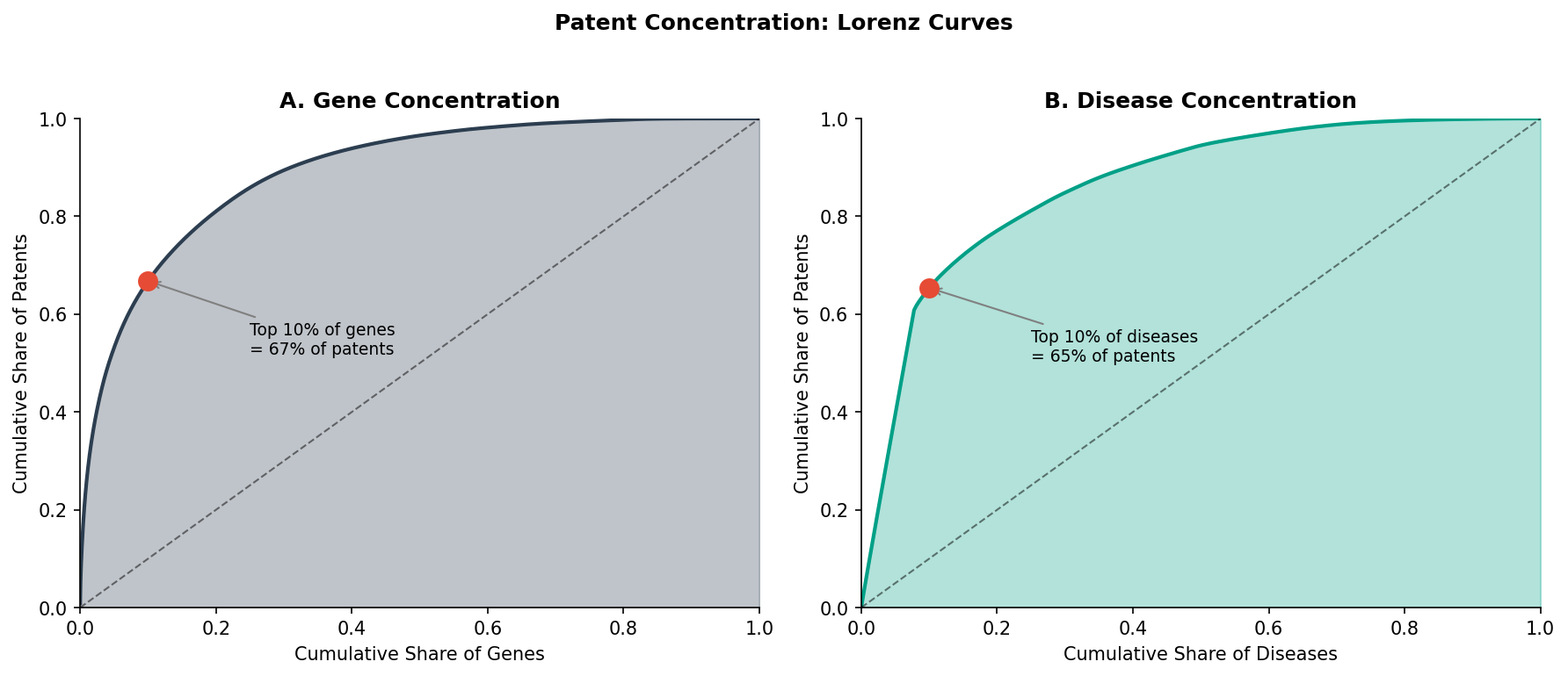
Key insight: Patent activity is highly concentrated. The top 10% of genes and diseases account for a disproportionate share of all patents.
8. Treatment Timing Distribution
When do gene-disease pairs first become treated at each spillover level?
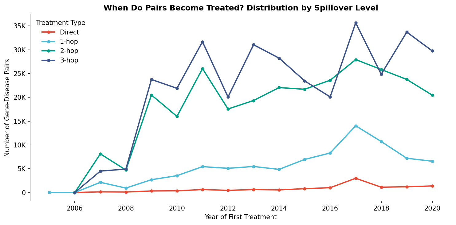
Key insight: Direct GWAS discoveries are relatively steady over time, while spillover treatments show more variation year-to-year.
9. Summary Dashboard
All key metrics in one view.
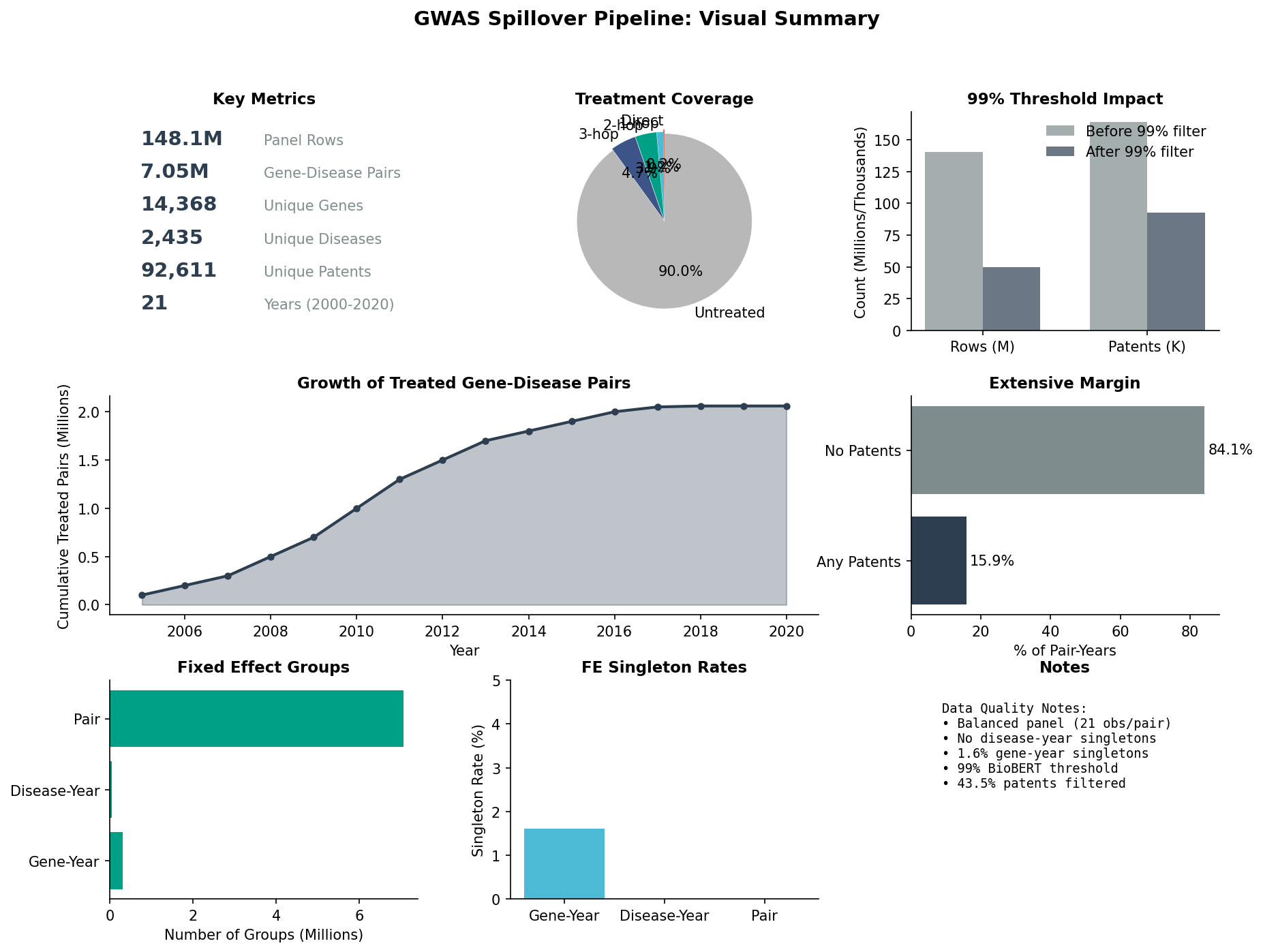
Data Summary
| Metric | Value |
|---|---|
| Panel rows | 148,124,655 |
| Gene-disease pairs | 7,053,555 |
| Unique genes | 14,368 |
| Unique diseases | 2,435 |
| Unique patents | 92,611 |
| Years | 2000-2020 (21) |
| Treated pairs | 2,062,294 (29%) |
| Treated observations | 14,849,919 (10%) |
See also: Detailed Results