Patent Analysis - Before and After Cleaning
Patent Analysis: Pipeline Data Quality
Generated: December 5, 2025
This analysis tracks patent data through the GWAS spillover pipeline, showing how filtering affects the dataset.
Pipeline Stages
The patent data flows through two key stages:
- Raw Patents - BioBERT extractions from Full_Patent.parquet (~140M rows)
- Filtered (99%) - After applying year filters (2000-2020) and 99% probability threshold
Summary Comparison Table
| Metric | Raw Patents | Filtered (99%) | Change |
|---|---|---|---|
| Total Rows (mentions) | 140,520,525 | 49,724,209 | -64.6% |
| Unique Patents | 163,928 | 92,611 | -43.5% |
| Unique Genes | 17,421 | 14,368 | -17.5% |
| Unique Diseases | 2,435 | 2,435 | 0% |
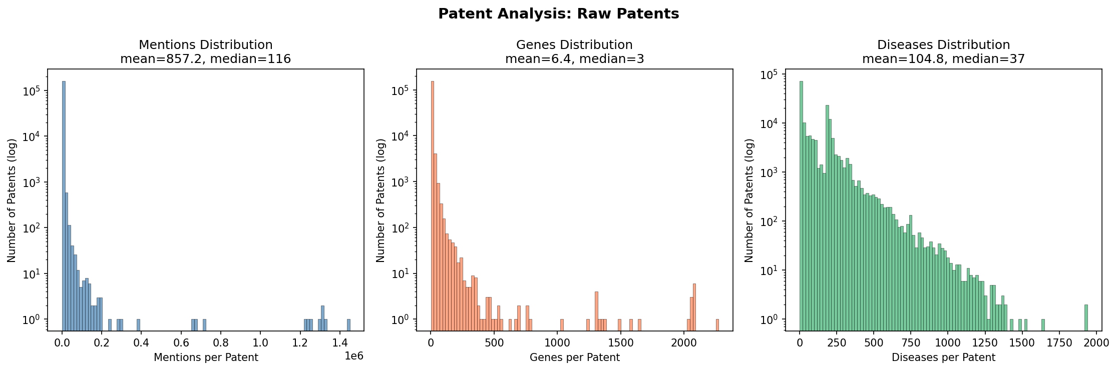
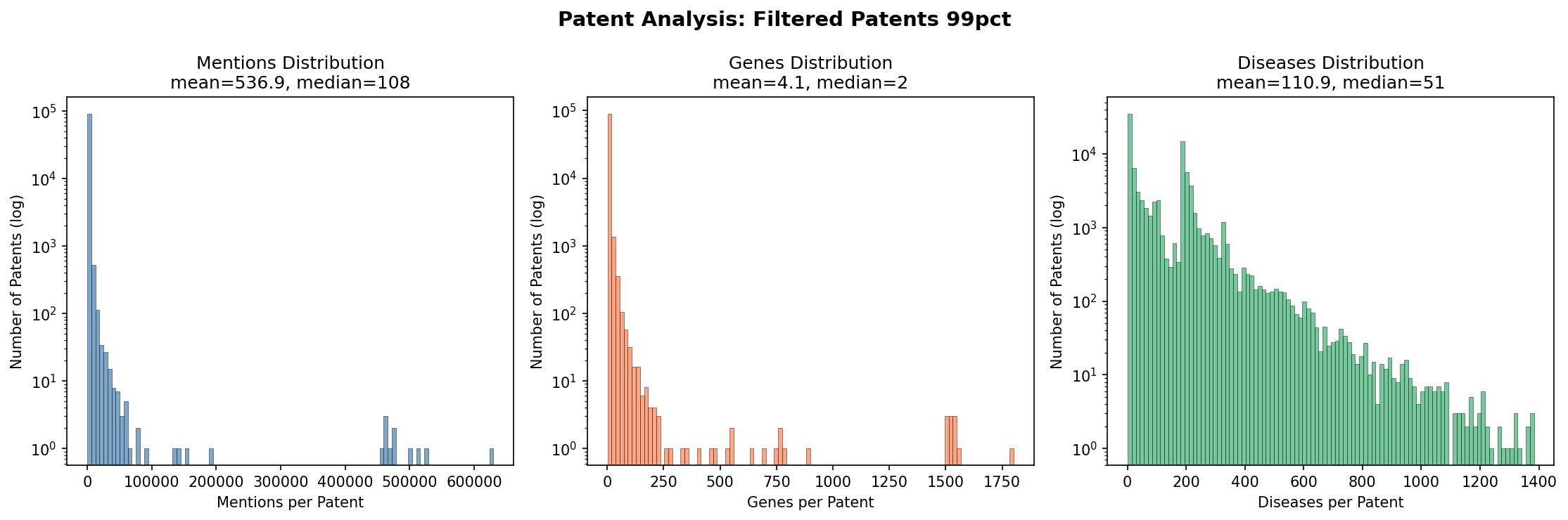
Mentions per Patent
Each row in the data represents a “mention” - a gene-disease pair extracted from a patent.
| Stage | Mean | Median | Std | Min | Max |
|---|---|---|---|---|---|
| Raw | 857.2 | 116 | 5,731 | 1 | 629,608 |
| Filtered (99%) | 536.9 | 108 | 5,731 | 1 | 629,608 |
Key insight: The distribution is highly right-skewed. The median patent has ~110 mentions, but outliers have 600K+.
Genes per Patent
| Stage | Mean | Median | Min | Max |
|---|---|---|---|---|
| Raw | 6.44 | 3 | 1 | 1,801 |
| Filtered (99%) | 4.06 | 2 | 1 | 1,801 |
Key insight: Most patents mention few genes (median = 2-3), but some mention over 1,800 genes.
Diseases per Patent
| Stage | Mean | Median | Min | Max |
|---|---|---|---|---|
| Raw | 104.8 | 37 | 1 | 1,383 |
| Filtered (99%) | 111.0 | 51 | 1 | 1,383 |
Key insight: The median diseases per patent increases after filtering (37 to 51), suggesting high-confidence extractions are concentrated in disease-heavy patents.
Visual Analysis
1. Comparison Across Pipeline Stages
Side-by-side comparison of key metrics before and after filtering.
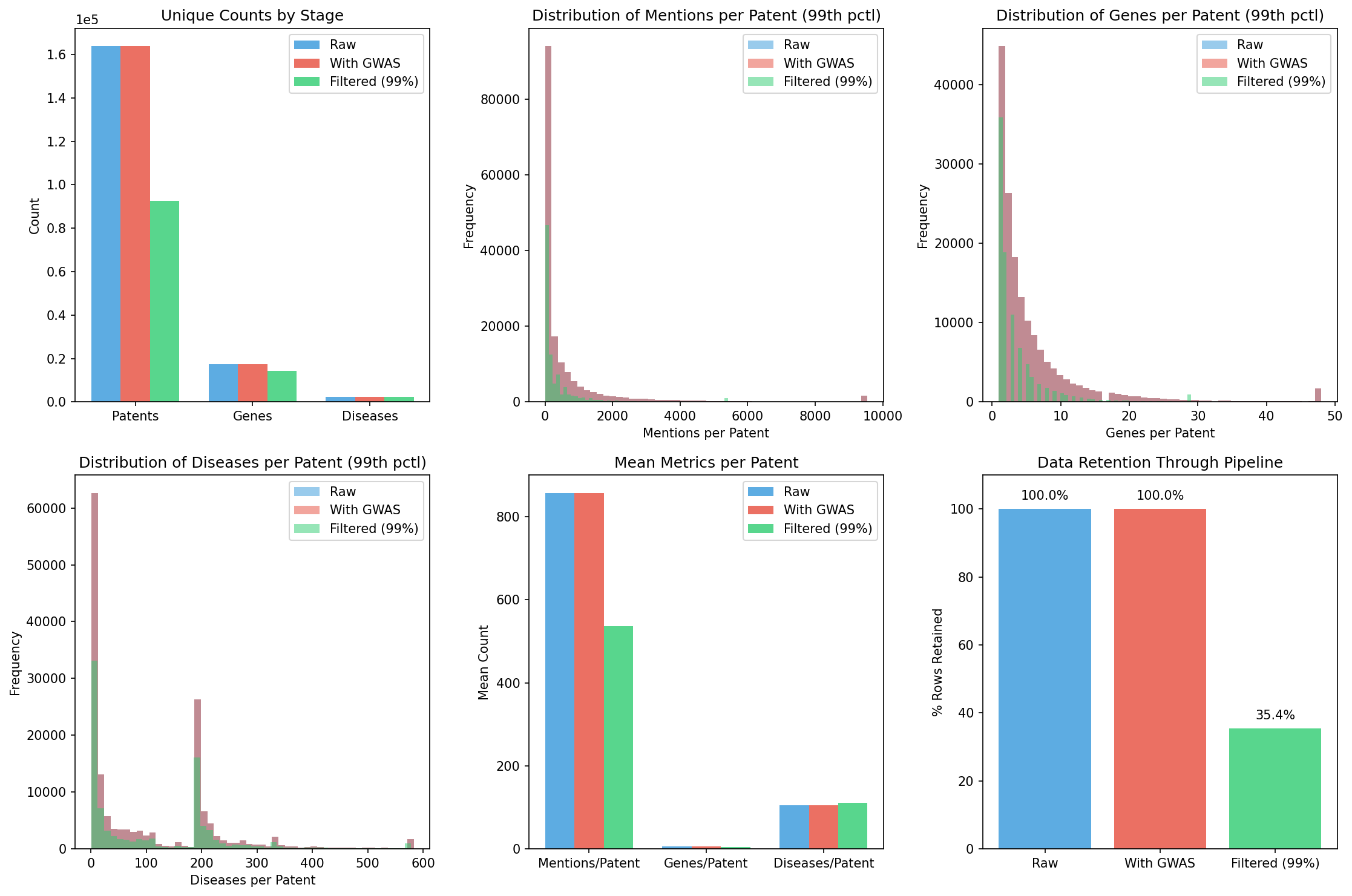
Panel descriptions:
- Top left: Unique counts (patents, genes, diseases) by stage
- Top middle: Mentions per patent distribution
- Top right: Genes per patent distribution
- Bottom left: Diseases per patent distribution
- Bottom middle: Mean metrics per patent
- Bottom right: Data retention through pipeline
2. Patent Year Distribution
Distribution of patents by grant year across pipeline stages.
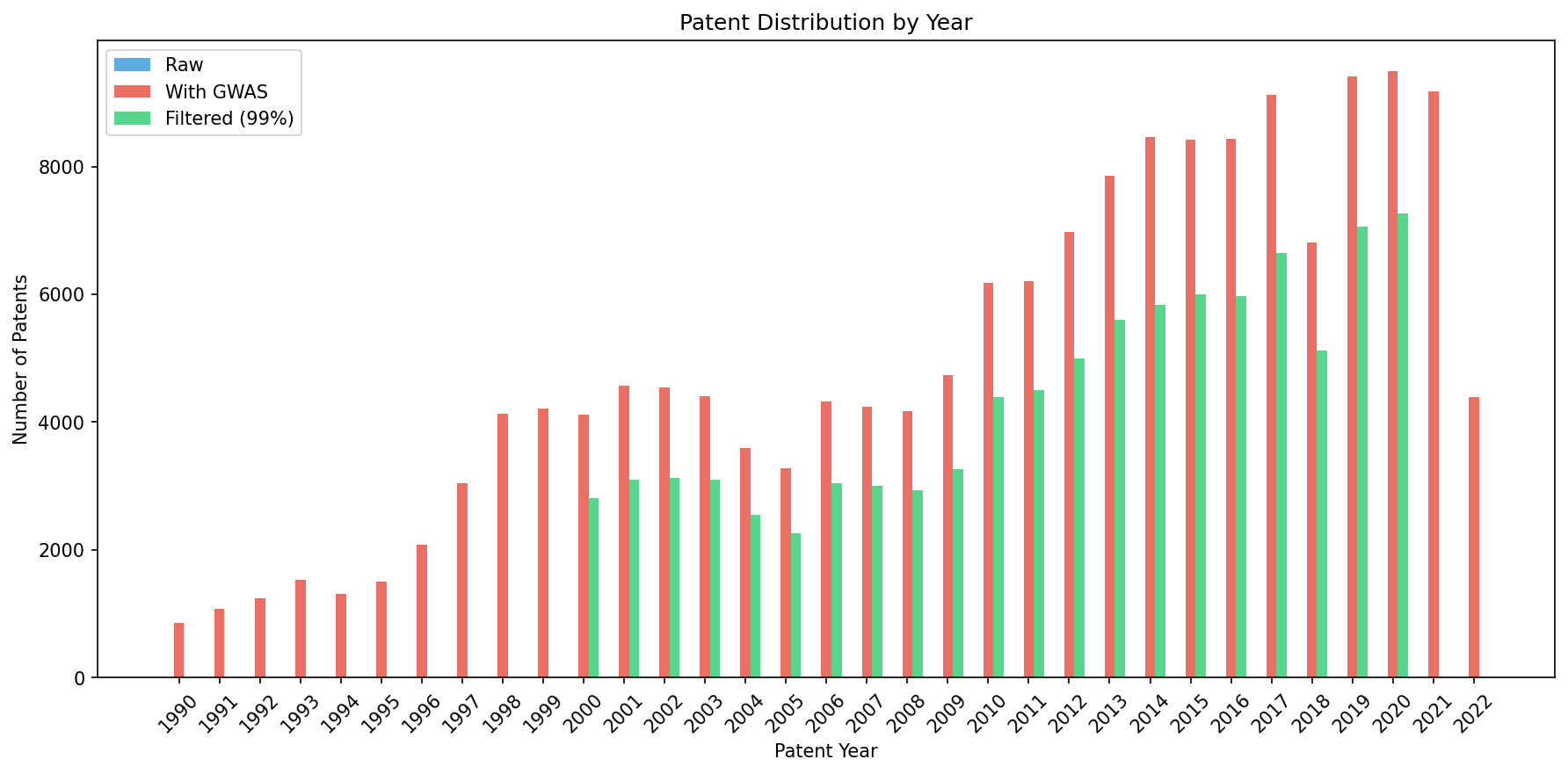
Key insight: The filtered data covers years 2000-2020, with patent volume increasing over time.
3. Raw Patents Distribution
Detailed distributions for the raw patent data (before any filtering).
4. Filtered Patents (99% Probability) Distribution
Distributions after applying the 99% probability threshold and year filters.
Key Findings
- Filtering removes ~65% of mentions but retains ~56% of patents
- Most patents mention few genes (median = 2-3) but many diseases (median = 37-51)
- Extreme outliers exist: some patents have >600K mentions, up to 1,801 genes
- Disease count per patent increases after filtering, suggesting high-confidence extractions are concentrated in disease-heavy patents
- The 99% probability threshold is aggressive but ensures data quality
Probability Distributions
For filtered data (sampled):
| Metric | Mean | Median |
|---|---|---|
| Gene probability | 0.9955 | 0.9958 |
| Disease probability | 0.9996 | 1.0000 |
The high median probabilities (99.58% for genes, 100% for diseases) confirm that the 99% threshold retains only the most confident BioBERT extractions.
| *See also: GWAS Pipeline Visualizations | GWAS Results* |